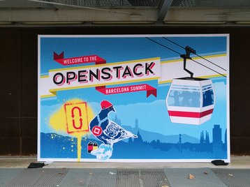
The OpenStack Foundation revealed an updated version of the logo for the open source cloud platform at the OpenStack Summit in Barcelona.
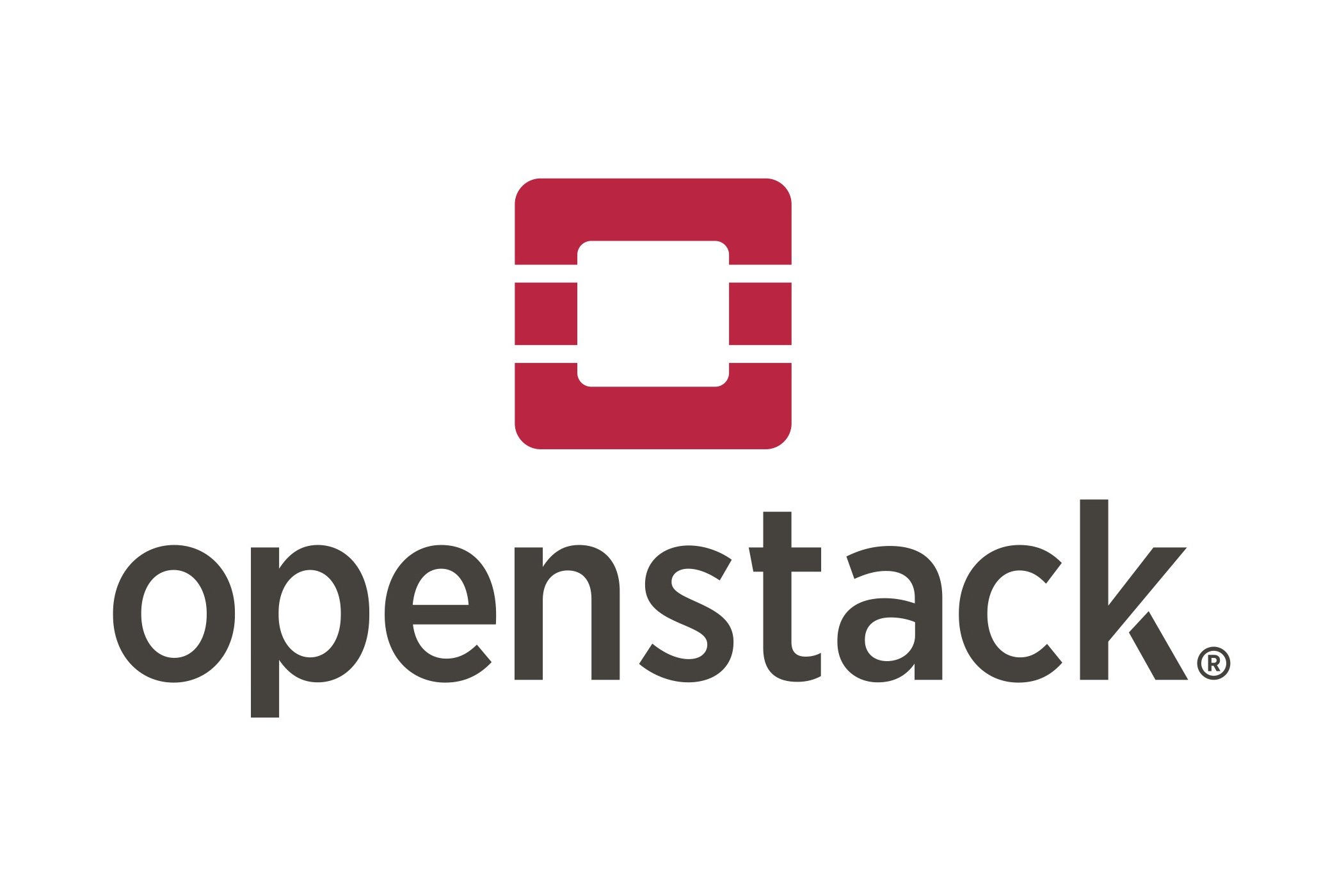
The new logo ditches the outdated 3D effect and shadow in favor of a simplified, flat design and a different shade of red. There’s also a new typeface, and consistent branding guidelines to go with it.
The new visual style will be rolled out gradually, with the foundation encouraging its members to adopt the logo in time for the next OpenStack Summit in Boston in 2017.
Looking the part
Since its inception in 2010, OpenStack has been trying to boost its enterprise credentials. For years, the open source project suffered from the fact that business community considered it a curiosity, a project of interest to engineers, but of little value to anyone else.
In the past year or so, the situation has started to change, with more than half of OpenStack projects out of development and into production. Earlier this month, 451 Research estimated that the market for OpenStack products and services will exceed $5 billion by 2020.
“We continue to believe the market is still in the early stages of enterprise use and revenue generation,” said Al Sadowski, research vice president at 451 Research.
“We expect an uptick in revenues from all sectors and geographic regions, especially from those companies in the OpenStack Products and Distributions category that are targeting enterprises.”
Today, the OpenStack Foundation manages almost 60 open source projects, and its branding appears on hundreds of partner websites. This week, the organization revealed a new logo to celebrate its success.
It was designed by Todd Morey, creative director of OpenStack, and follows the same design trends that are shaping the look of commercial software like Windows 10, Ubuntu, Android or iOS. The faux-3D effect is gone, replaced by a simple two-dimensional shape.
Gone are the gradients and shadows, and even the ‘Cloud Software’ tagline. All that remains is a simple red ‘O’. The updated branding guidelines and assets are available on the OpenStack website.